The latest Polar news, expert advice, and hottest topics in sports, fitness, and training.
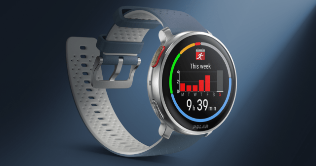
Discover the all-new Polar Vantage M3, a stylish and powerful multi-sport watch.
Clear selection
Explore the art of slowing down with purpose. From smart recovery strategies to prepping for your next A goal.